

Making stuff since 2011
In Tokyo
Inside the redesign of a search experience that moves 100 million people

Overview
This project is being deployed progressively at the moment.
BlaBlaCar is the world's leading carpooling platform. In recent years, it has expanded to include other modes of transportation such as trains and buses.
The platform is accessible in 21 countries across Europe, South America and India. They have 100 million users worldwide.
Problems to solve
The platform was originally designed for mobile, specifically for carpooling. Since then, it has evolved to include other modes of transportation. As of now, we know that a lot of traffic originates from desktop users, particularly those purchasing train tickets. The current search experience is therefore not tailored for the current and future needs.
Additionally, the current search is not optimized to accommodate the individual needs of some countries.
BlaBlaCar approached me to completely rethink and restructure their search experience. For both their desktop and mobile platforms, including single-page applications (SPA) and mobile apps.
The process
I worked in close collaboration with:
the Product Manager for the search product team
the Lead Front Developer
the VP of Design
the VP of Product
the Design System Designer
I led the design work, while staying closely connected with fellow designers across other squads to share insights, align on patterns, and keep the experience consistent.
Seeing the complexity of the project and the number of interested parties, I knew that defining the strategy early on would greatly improve the chances of success, so we took some time to define how we were going to work:
define who was responsible, who took final decisions and who was consulted (RACI)
define how we were going to communicate our progress to stakeholders
define how we were going to ship the solution, in our case, we knew milestones mades sense (see below)
And then, we first chose to focus our attention on:
the search results: how do the results appear, which information should we display for each type of transportation?
the trip detail: how do we see all the details about a trip like cancellation policies, itinerary, information about the driver?…
the ticket selection: how, for specific transport, we showcase the choices available.
We did not include in this phase the filters and search forms
Gather and define all the needs
Based on user feedback, user interviews and product visions for the next years.
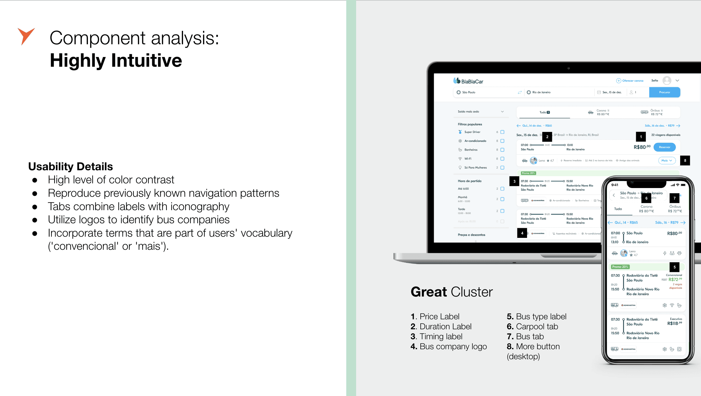
One of the main intuition we got from the start, was that users should be able to make 90% of their decision based on the list of results.

Benchmark
What do other platforms with similar needs do? Can it help us find ideas or make decisions?
Design
Instead of jumping into specific use cases right away, we explored broader design directions that could address the core problems. I began with low-fidelity wireframes in Miro to quickly test ideas. From those early concepts, we identified two promising directions, which I then developed further in Figma.


User-tests
We partnered with the user-research team to test basic prototypes with users. I came up with the objectives and prototype. We did 3 sessions in total, one in France, one in Brazil and one for Ukraine, around 30 users in total. The results validated each time our intuitions and choices, and also highlighted some areas of improvements.
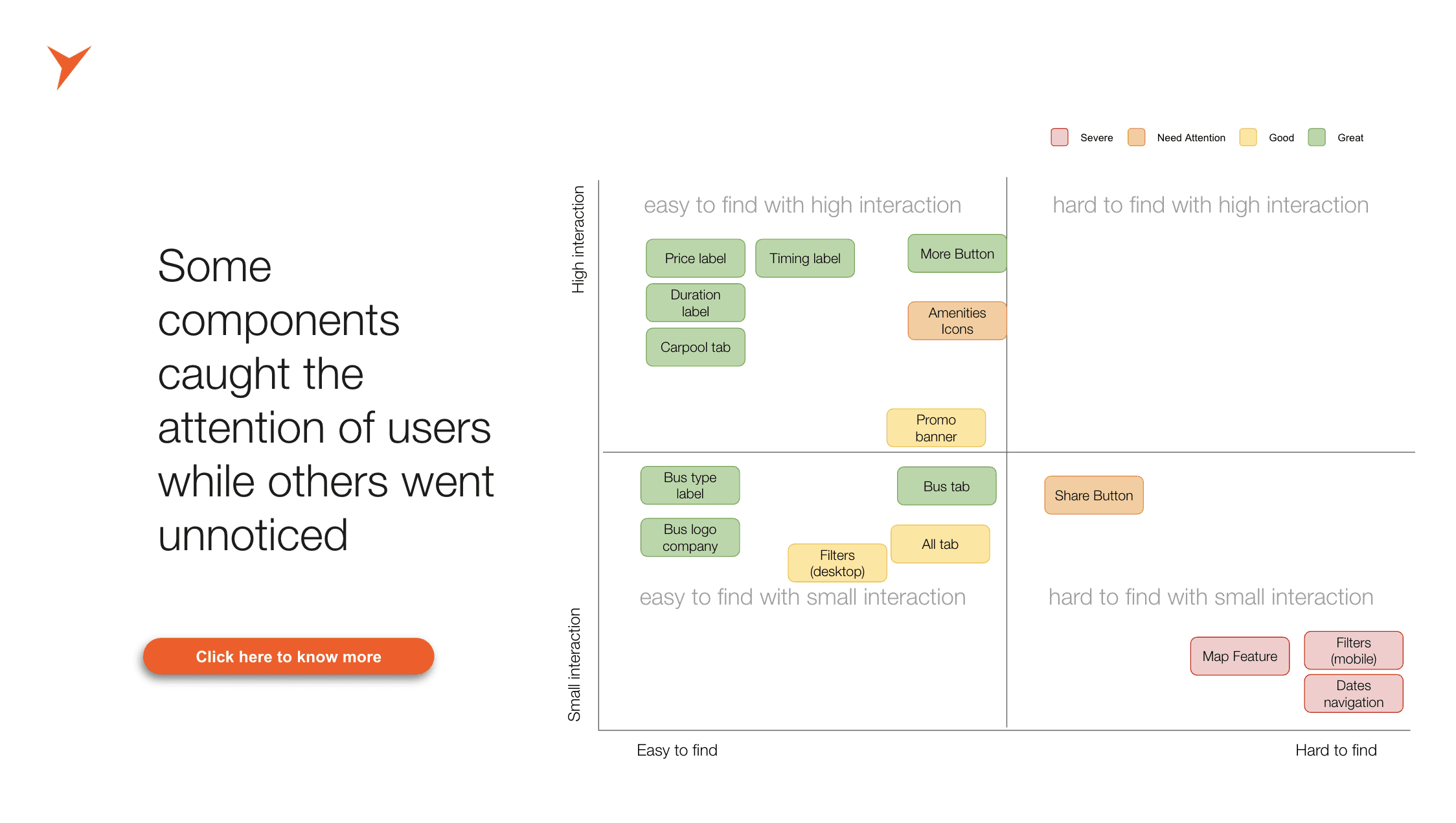

Iterate on the design and focus on specificities
Take the solution further by defining how it can adapt to the specific needs of each country and transportation mode while accounting for local constraints, behaviour and platform variations.
The biggest complexities
Adapting to country needs
The main difficulty was due to an intuition we got from the beginning: the experience should be super similar between different types of transport. Meaning that, as a passenger, I can easily compare carpool, bus and train trips together.
Meanwhile, each transport has different needs, for instance
carpool trips need to show information about the driver and their preference
bus trip needs to show the bus station name, but that’s not useful for carpool
train have different classes, other transports don’t
etc…
On top of that, each country has also different cultural or legal specificities.
Design-system changes
On the technical side, we aimed to keep changes to the BlaBlaCar Design System minimal, which proved challenging, especially for desktop. The system had originally been built with a mobile-first approach, so many components and spacing rules didn’t scale well to larger screens. I worked closely with the Design System Lead to evaluate what could be adapted or extended, and to carefully assess the ripple effects across the product ecosystem before making any updates.
Outcomes
Here are a few key design decisions we made during the redesign:
We treated all trip cards equally, regardless of the transportation mode. This ensured a cohesive layout and helped users answer their most important questions at a glance: when is it leaving, from where, and at what price?
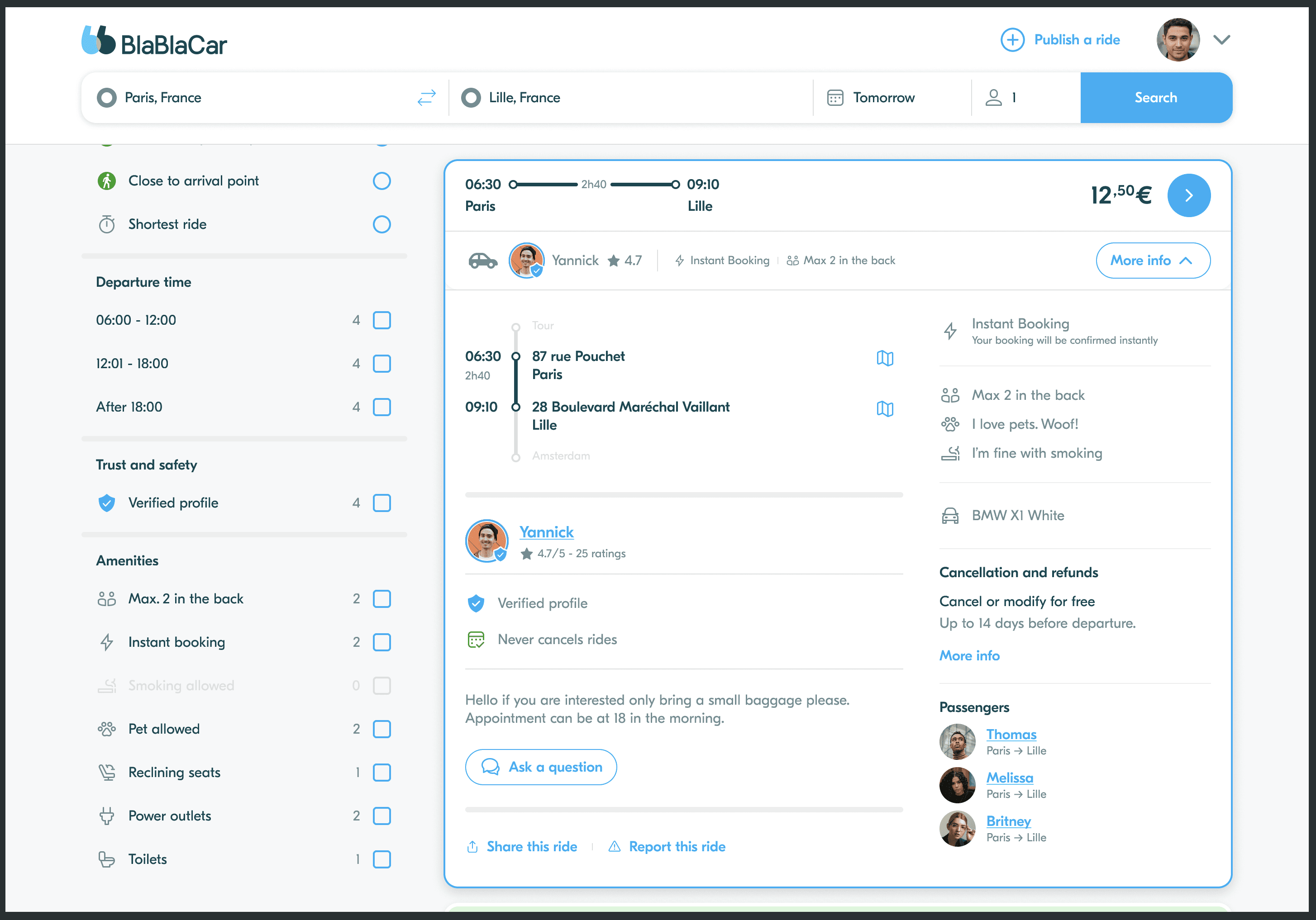
On desktop, we introduced expandable cards. This allowed users to access more information without leaving the results page, making comparison easier and reducing friction in the booking flow. This was one of the most positively received changes during user testing.
We highlighted “smart” trips — curated or algorithmically favorable options — to guide users toward better decisions, faster.
For carpool results, we added quick access to Google Maps. Since users often struggle to understand vague or unfamiliar pickup points, showing a full address wasn’t helpful and added clutter. A direct link to the location offered clarity without noise.


Impact
This project is being deployed progressively at the moment.
Rather than tying success to one global metric, we defined tailored objectives and KPIs for each milestone, each aimed at solving specific user and business problems. One key milestone was to improve the result list so users could confidently choose a trip without opening each detail view.
After launch, we observed a sharp decrease in ride detail openings, indicating that users could now compare options directly from the search page, a strong sign of improved clarity and decision efficiency.